
Other typefaces are shown courtesy of Emigre, Font Bureau, FontShop, House Industries, Mockingbird Font Works, URW, Lanston Type Co., Ltd., Adobe, and the MicroFoundry. See colophon for more details.
|
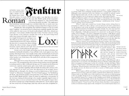
The principal typeface used in Graphic Design & Reading is Bembo set 11/13 (eleven point size with two extra points of leading). Side notes, captions, and incidental material are in ITC Franklin Gothic Book. ITC Franklin Gothic Demi is used for authors’ names and other emphasis and the Heavy weight is featured in some drop caps and titles. Other typefaces are shown courtesy of Emigre, Font Bureau, FontShop, House Industries, Mockingbird Font Works, URW, Lanston Type Co., Ltd., Adobe, and the MicroFoundry. See colophon for more details. |
|||
|
||||
|
||||
|
||||
|
||||