
 Gunnar Swanson Design Office
2021:

Fires have apparently replaced earthquakes in the myth of a Californian hellscape. (Well, the social and structural disintegration in the ugly aftermath of socialism is the real horror if you listen to Mark Levin.) I played Warren Zevon’s “Desperados Under the Eaves” during one of my last classes at East Carolina University. (The first two thirds of 2021 were in North Carolina for me.) One student in particular stared blankly from a little Zoom window. He was in diapers when Zevon died and the song was more than twice his age so it’s not surprising that it wasn’t his taste in music but I said that he had to appreciate the rhymes:.
If California slides into the Ocean
like the mystics and statistics say it will
I predict this motel will be standing
until I pay my bill.
He didn’t understand it. I didn’t understand him. Rosemary later pointed out to me that he had probably never heard the falling-into-the-ocean in the big earthquake trope.
Back when everyone seemed to think that the San Andreas was the only real fault, the “big one” seemed likely to cause a split that would leave the coastal region cascading into the Pacific. I always speculated that the other side might collapse into the Atlantic, leaving an island reminiscent of the novel that gave the state its name. But either way, we slid into home here at the Mythic Hellscape Stadium (and we have no plans to go back to Annandale.)
(Thanks to Garci Rodríguez de Montalvo, Charles Richter, Warren Zevon, Donald Fagen & Walter Becker, and Massimo Vignelli.)
2020:

Somehow my art history degree left me with more of a connection to the saints than my wife’s dozen years in Catholic schools did for her. St Sebastian is my favorite. There were a lot of paintings made of him (including three by Mantegna and seven from Guido Reni.) The story is that the arrows were reminiscent of the wounds of bubonic plague so St Sebastian paintings were given as protection against the Great Mortality (later rebranded as the Black Death.) People assume from the paintings that Sebastian was martyred by being shot full of arrows. There was a plot twist: he miraculously recovered from those wounds but then was clubbed to death when he returned to lecture the emperor on his treatment of Christians. I guess it is sometimes healthier to keep things to yourself but I never really learned that one.
When the School of Art & Design at East Carolina University asked for a picture of me for their faculty/staff directory, I decided to provide some protection against covid-19. They refused my medical intervention, requesting a “regular portrait,” so I offer my martyr cosplay to you here. May we all be protected.
It was only after I’d completed my Mantegna mashup that I realized that my introduction to my favorite martyr was long before I found myself in the dark lecture halls of UC Irvine and UCLA art history classes. George Lois did an amazing series of covers for Esquire magazine including Sonny Liston as Santa Claus in 1963 and Andy Warhol drowning in a can of soup in ’69 but the April, 1968 cover depicting Mohammed Ali shot full of arrows with his hands tied behind him stands out for many reasons. (By the way, Lois comes across as an arrogant jerk in many interviews but, in the short time I once got to spend with him, he was one of the warmest and sweetest guys I’ve ever met. And he had warm and sweet stories of Ali.)
(Thanks to Andrea Mantegna, Emperor Diocletian, and George Lois.)
2019:

I’ve read more critical theory than my cognitive health can sustain. Don’t tell me that the translation is flawed; despite any mental destruction atributable to my reading habits, I know that ancient Romans didn’t make goose sauce, gander sauce, or cliché aphorisms like 17th century Brits. Anyway, as the less-ancient Romans really did say, Traduttore, traditore.
Despite its tanning booth golden tones, my goose is, apparently, white like me. I reject accusations of pallid gander privilege, however. I am, as I regularly state, the luckiest son-of-a-bitch in the world but I don’t have undue privilege. On the contrary, way too many other people are denied their human rights. The problem is not that I am granted too much but that so many are denied so much. This is not a silly quibble, a symptom of my being a contrarian, or just more yammerings of an egoist blinded by his own oh-so-white light. Getting the problem wrong gets in the way of getting the solution right.
(But I think I may have just outed myself as a Eurocentric carnivore.)
(Thanks to Steven Cerutti, Charles Thompson, William Barton, and Charles Dickens.)
annual crankiness
Happy as a clam? I took some time off from my streak of producing little gems in response to irritants. I may not have really been an oyster after all.
2013:

Tribal politics continue to dominate. What populist movement of largely family-oriented, religious people do you back? And what’s your slimey green veggie of choice? Okra or nopales? (No justice, no pise.)
(Thanks to Christopher Gadsden, to Antonio Gómez, Jorge Enciso and the entire the in-house design group for Tenochtitlan, and to Armin Vit and the Under Consideration Culture Guide and Translation Services Group.)
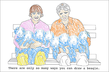
But, in the end, my recent focus on copies and copying (stay tune for a book announcement) and a pragmatic streak that looks for the way policy plays out for actual people makes Modern Dog’s copyright case against Disney, Jaya Apparel Group, and Target stand out. (I won’t recount the details of the case but material designed by Jaya and sold at Target to promote a Disney film was clearly copied from Modern Dog’s book.
US copyright law is overreaching. Coverage is too extensive and the time periods are absurdly long. I believe that copyright maximalists (like Disney, for instance) are hurting culture and creativity as much as trolls like Bridgeport Music and, despite the blindness of judges to the issue, copyright as it stands violates first amendment rights to expression. I’ll even defend the big guys against the little guys. There is, however, a need to protect creators against predatory business practices.
Jaya might not be the big name on the list but it’s a $150 million dollar company. Target might seem to be another victim but they seem to be competing to become central in a tale of bad faith. And the irony of Mickey’s gang—the forefront of the ever-increasing monster that is copyright—hiring attorneys who would claim that copyright doesn’t apply to Modern Dog’s dog drawing because “there are only so many ways you can draw a beagle” is startling. How many ways can you draw mouse ears or recycle fairy tales?
(Thanks to Jeff Koons and/or Art Rogers, Crayola, and Corr Cronin Michelson Baumgardner & Preece LLP, the folks that show us that there is no “shy” in “shyster.” Click here for larger image in a new window.)
2012:

I suppose what really made me really cranky in 2012 were the several people who took the Obama signs on face value. Being a “birther” requires being indecent, stupid or naïve, and delusional. Wouldn’t William of Occam or Nate Silver (links appear in new windows) tell us that it’s at least slightly more likely that I’m just one or two of those?
(Thanks to Mannie Garcia and/or Sheppard Fairey; George K. Warren, Soyuzfoto, Alberto Korda and/or Jim Fitzpatrick, John Mayall; Eric Poppleton, Helane Freeman; Roger Excoffon, the nation of Kenya, and the Masai tribe.
2011:
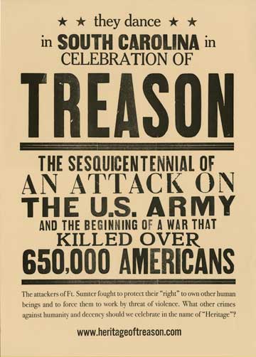
See www.heritageoftreason.com (link appears in new window) if you want to read me kvetching about this one.
(Thanks to Craig Malmrose who printed this with me. [We sometimes put up with each others’ cranky tendencies.])
QOL Apps/ICD Coach
Sam Sears (links open in new tabs) is a psychologist at East Carolina University (where I taught graphic design.) Sam has pioneered the study of the emotional outfall of implantable cardioverter defibrillators (ICDs.) He lectures and consults widely. The project was to put Sam in a bottle with ICD Coach, an app for mobile devices, a website, etc. QOL-Apps (as in Quality of Life Applications) was the parent company. I designed trademarks (including custom lettering) and navigation icons. I worked with a great team (including Keon Pettiway and Brian Schroeder) that developed websites and the app.
ICD Coach was purchased by Medronics so we have no plans for any new versions.


In the end, the point was to change lives. Anyone interested in a tattoo?

![]()
not-so-new jerseys
Cotton Country Century jerseys celebrate the 100-mile annual ride through Eastern North Carolina in the form of stretchy fashion design. See more on the boll weevil below.


It was a struggle to keep the production people from “helping me out” on the EC Velo jerseys by adding type outlines and making sure that nothing bleeds. In the end, there are a couple of details I could quibble about but they did a better job than I could have hoped for.

Graphic designers love to tell you that we’re all about strategy not about mere surfaces. Designers who are Modern Boys (like me, for instance) especially disdain the appellation “decorator” but it doesn’t require a PhD in rhetoric to figure out that most of what you say is how you say it. I’m happy to talk business and communication strategy all day but surface decoration isn’t something separate. I don’t think that graphic design is all about fashion but I suspect that fashion design isn’t, either.
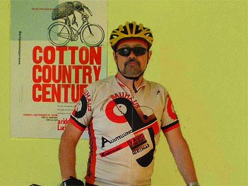
Joost Schmidt seemed confused with the graphic designer/fashion designer question when he designed this one for me. I’m going to need to do a lot of intervals on my stainless steel bicycle if I hope to pedal 88 mph and get back to ask him about it. (I printed the slightly less famous poster in the background with Craig Malmrose.)
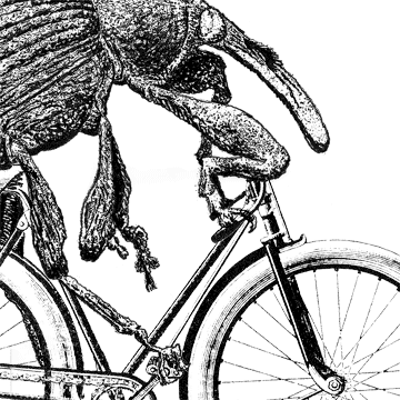
inordinate fondness for beetles

The Cotton Country Century was a long-term project. I did posters and tee shirts for nine years and jerseys for four. The feature that has persisted through the years is the illustration of the boll weevil on a bicycle. The bike started out as an old wood engraving. I removed parts and moved other parts in Photoshop, drew the beetle, and combined the pieces. (I don’t think of myself as an illustrator but the Society of Illustrators included it in their annual show and book in 2008.)
something other than bicycles
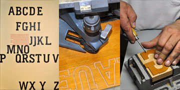
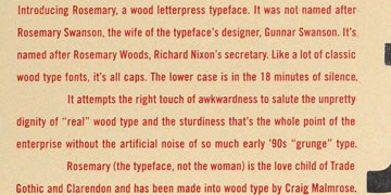
Speaking of Craig Malmrose and wood type posters—I was; under the photo of the Joost Schmidt jersey; pay attention—here ’s the typeface I designed that Craig has made into wood type for letterpress printing. It’s called Rosemary. It’s named after Richard Nixon ’s secretary, Rose Mary Woods, rather than my wife (a Rosemary with better judgment in the company she keeps.)
It’s a bit like a clarendon—s flesh hung on the skeleton of Trade Gothic. I did a bit of orthopedic surgery on the skeleton but a good forensics anthropologist with a former vampire/sniper FBI agent sidekick would identify it. (Wow, a really archaic television refernce. And who would have even thought that Bones would have gone on for over a dozen years?) If you’re a lawyer from Mergenthaler Linotype or an heir of Jackson Burke, meet me out in the alley and we’ll duke it out; JB and Trade Gothic owed much to Morris Fuller Benton so maybe ATF Davidson will buy me a beer when I win that fight.
(2' x 3' announcement poster designed by Gunnar Swanson and printed by Gunnar Swanson and Craig Malmrose, Craig’s pantographic mill at work, and Craig hand finishing a letter shown above. Detail of poster—text set in Trade Gothic—below.)
 Gunnar Swanson